If we look at the graphs in post 63, I think #2 and #4 are too smooth to be accurate. The absence of noise suggests oversimplification to me, and makes me suspect the presenters' agendas.
Let's concentrate on #4, which can be determined to a high degree of precision from extant physical records, e.g. ice cores.
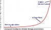
Here's your graph from bbc.co.uk ... it looks like a low-order polynomial fit; it's so smooth.

Now here are other graphs covering the same time period. Note the features missing in the too-smooth curve, like the bobbles in the early 1800s, ~1925 and ~1950.


Then there's this one ... different ordinate range, but now there's an outright inflection in the early 19th.

These are datafrom the same narrow set, and presented differently, they evince completely different gut responses from the person looking.
So yes, I do think that graphs can lie even while not deviating (with apparent significance) from fact. cn
I don't necessarily have an issue with smoothing as long they aren't purposely manipulating the overall picture. However, I do have a problem with the first three charts showing a straight upward march for CO2 by leaving out the time when temperatures dropped and pulled CO2 down with it. Also, why 1744 as a starting point for CO2 charts that are from proponents of global warming? They always start at 1850/1880 for charts on temperature? It isn't because of lack of measurement, they get CO2 levels from a logical analysis of ice cores and such. Temperatures are derived in a no less scientific way.