Ace Yonder
Well-Known Member
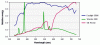
That graph is nice but it is worth noting that that is just the visible spectrum. Check out this graph of relative energy output. The blue line is a 5500K CFL and the green line is a 5500K MH. Note that the MH has very intense spikes at very narrow bands of light whereas the CFL has a very wide spectrum of actual output, even though they both appear the same color (5500K) to the human eye.
Attachments
-
 7 KB Views: 6